
02Visual
Tiered Partnership Organization Chart
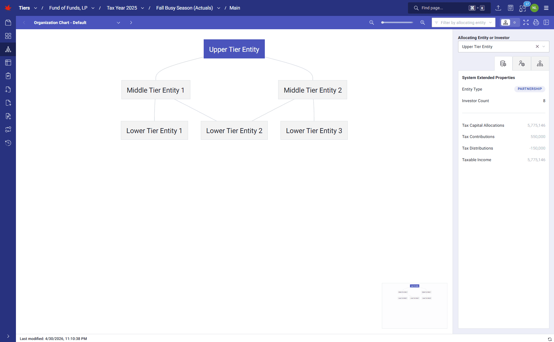
TIERS displays the full tiered partnership structure in an interactive organization chart built from the calculation logic and system outputs. Users can review entities, investors, ownership paths, upper and lower tiers, and key status details in one visual workspace.
How it runs
TIERS draws the organization chart dynamically from live inputs and outputs. Clicking an entity shows calculation summaries, capital activity, entity metadata, investor counts, and the upper-tier K-1s generated or lower-tier K-1s received. User-defined properties such as preparation status, formation date, critical matters, and delivery deadlines can be color-coded and overlaid on the chart.
What it transforms
Static diagrams and spreadsheet entity maps become a live visual control point for the engagement. Teams can confirm the ownership structure before allocations and form production begin, reducing stale-chart risk, missed relationship changes, and review uncertainty across large tiered structures.
Walkthrough
1 of 4 · VISUAL
Click to zoom. Scroll freely — pinch or Ctrl+scroll to zoom further. Drag when zoomed.
Next step
See TIERS with your data
Request a guided product briefing.