
11Visual
Partnership Tax Engagement Dashboard
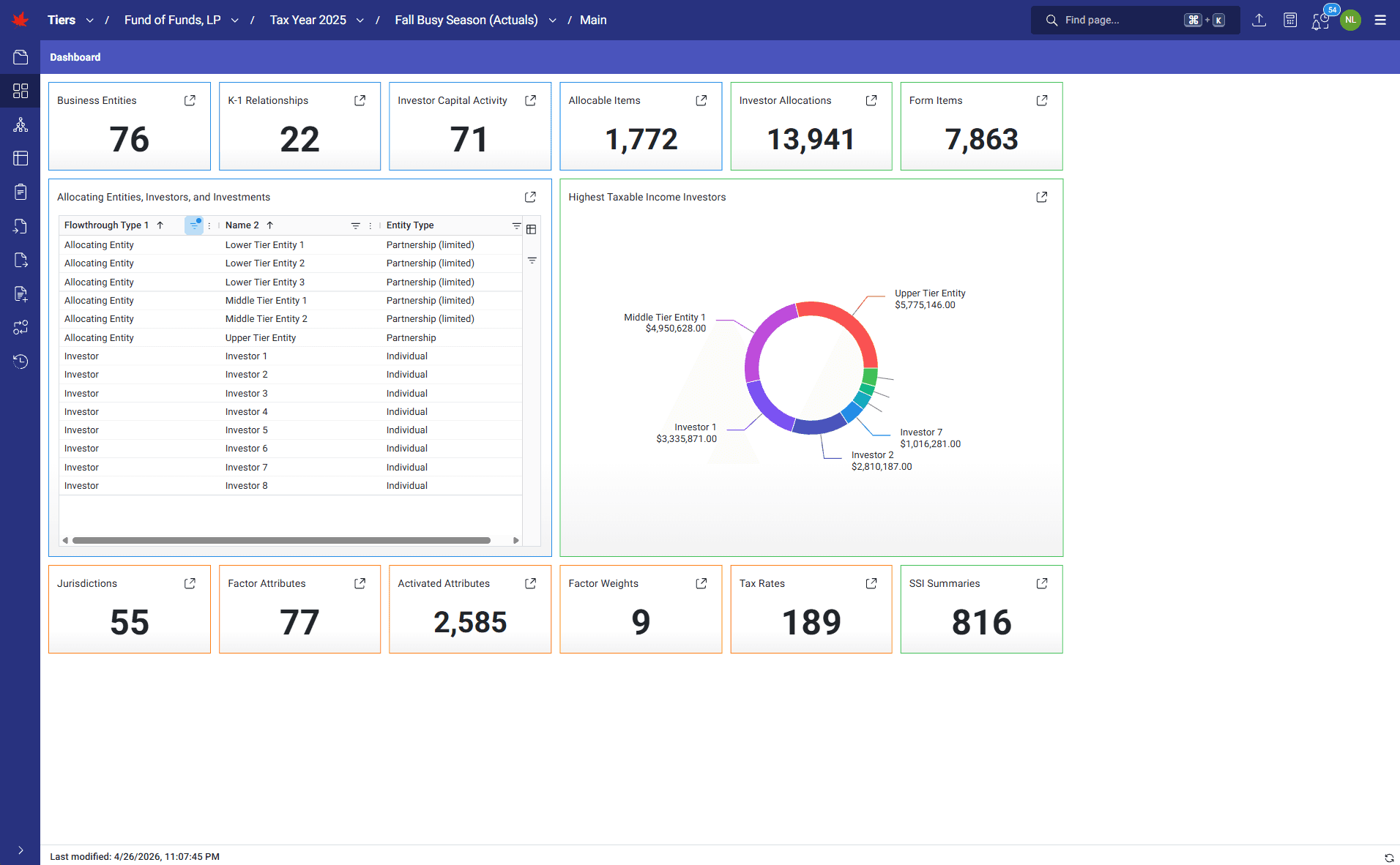
TIERS' dashboards give users an immediate read on their engagements through configurable count cards, list cards, charts, and Power BI template widgets. Teams can quickly understand project status, open related inputs or outputs, review selected live data, and download Power BI templates with the TIERS data they depend upon.
How it runs
Engagement superusers configure their dashboard around the records and views that matter to each specific engagement. Count cards show totals for any input or output and link directly to the underlying dataset. List cards display selected rows and columns from live TIERS data. Charts summarize output data visually, such as where income is concentrated or which investors carry the highest taxable income. Power BI template widgets connect a saved template to specific TIERS inputs and outputs, so users can download the template and current calculation data together as one package.
What it transforms
Scattered status spreadsheets and separate reporting tools become a shared engagement command center. Teams reduce stale-status risk, navigate faster to the data that needs review, and keep management reporting connected to the latest production calculation.
Walkthrough
1 of 2 · VISUAL
Click to zoom. Scroll freely — pinch or Ctrl+scroll to zoom further. Drag when zoomed.
Next step
See TIERS with your data
Request a guided product briefing.